Creating Bar Graphs
Watch this topic in 60 seconds
Free preview · Lesson 1
Understanding Creating Bar Graphs
Let's Build Bar Graphs! (Like Building with Blocks!)
Hey super learners! Have you ever tried to organize your toys? Maybe you have a lot of LEGOs, some action figures, and a few race cars. If you wanted to show your friend how many of each toy you have, how would you do it? You could just tell them, "I have 10 LEGOs, 5 action figures, and 3 race cars." But what if you wanted to show it in a really clear, easy-to-understand way? That's where a super cool tool called a **Bar Graph** comes in!
What is a Bar Graph?
Imagine you're at a candy store, and you want to see which candy is the most popular. A bar graph is like a special picture that uses tall, colorful 'bars' (like towers made of blocks!) to show how much or how many of different things there are. It helps us compare things quickly and easily, just by looking at how tall the bars are.
Think of it like this: If you have a group of friends and you want to know everyone's favorite animal, you could ask each friend. Let's say Sarah likes dogs, Tom likes cats, Emily likes dogs, and Mike likes fish. Instead of just listing them, a bar graph helps us turn this information into a visual story!
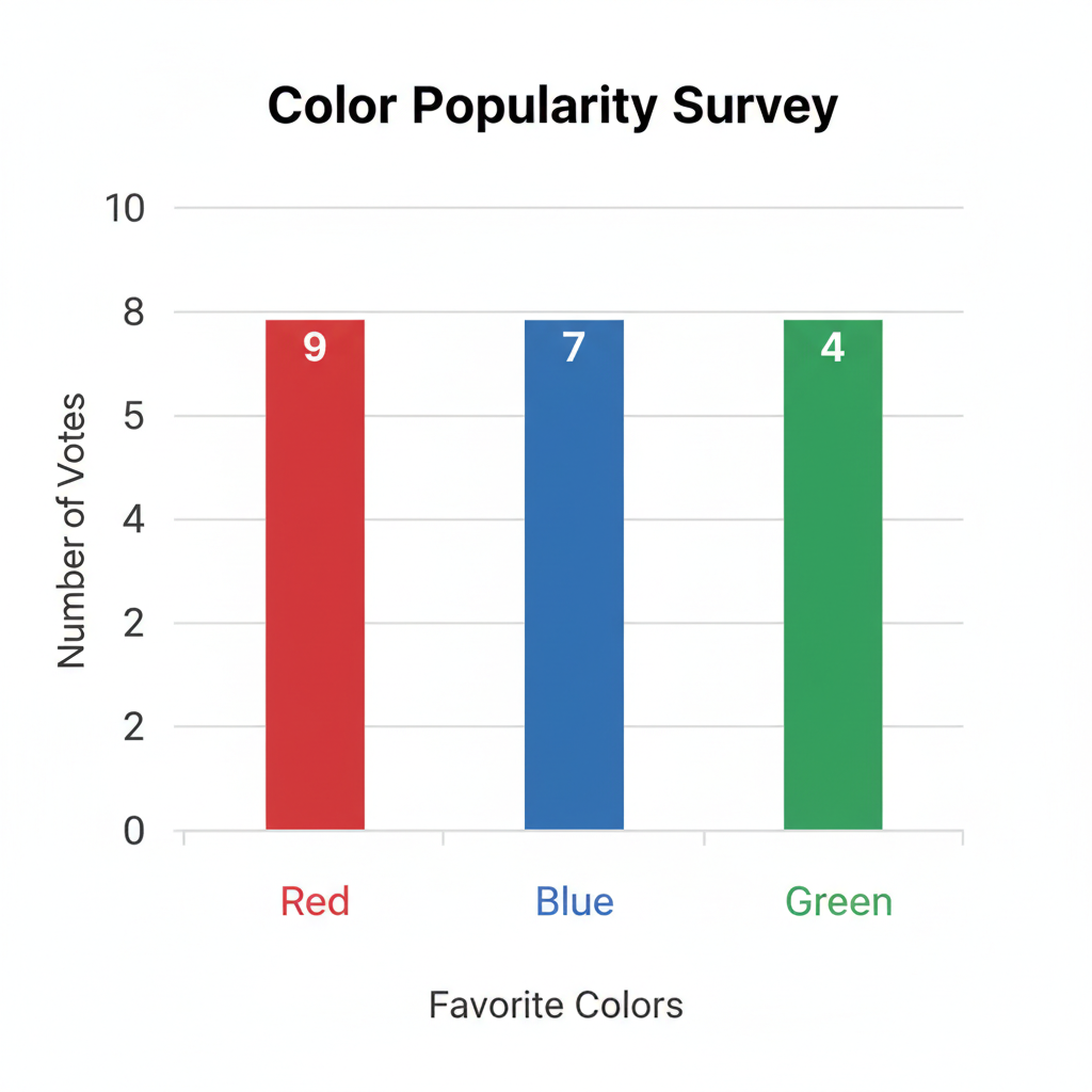
The Super Parts of a Bar Graph (Like the Parts of a Robot!)
Just like a robot has different parts that help it move and talk, a bar graph has different parts that help it tell a clear story. Let's meet them:
1. The Title: What's the Story About?
Every good book has a title, right? A bar graph needs a title too! The title tells us exactly what the graph is all about. Is it about "Favorite Pets"? Or "Number of Apples Eaten"? It's like the name tag for your graph.
Analogy: Think of the title as the name of a movie. Before you watch, the title tells you if it's about superheroes or talking animals!
2. Labels: What Are We Measuring?
A bar graph has two important lines, often called **axes** (say "axe-eze"). Think of them like the roads on a map. Each road needs a name!
-
The Bottom Line (X-axis): This line goes across, side-to-side. It usually tells us what we are counting or comparing. For example, if we're counting favorite fruits, this line might have labels like "Apples," "Bananas," "Oranges."
Analogy: This is like the different shelves in your toy box, one shelf for cars, one for blocks, one for dolls.
-
The Side Line (Y-axis): This line goes up and down. It usually tells us how many or how much of each thing there is. It's like a measuring stick! This line will have numbers on it.
Analogy: This is like the steps on a ladder. The higher you go, the more steps you've climbed!
3. The Scale: How Many Steps?
The numbers on the side line (Y-axis) are called the scale. This tells us what each step on our "ladder" means. Do we count by 1s (0, 1, 2, 3...)? Or by 2s (0, 2, 4, 6...)? Or even by 5s (0, 5, 10, 15...)? Choosing the right scale helps make our graph neat and easy to read.
Analogy: If you're counting jellybeans, you might count by ones. But if you're counting how many stickers you have (and you have hundreds!), you might count by tens or twenties to save time!
4. The Bars: The Towers of Information!
These are the tall, colorful rectangles that give the bar graph its name! Each bar stands for one of the things you are counting (like "Apples" or "Bananas"). The height of the bar shows how many of that thing there are. A tall bar means many, and a short bar means few.
Analogy: Imagine building towers with LEGOs. If you have 10 red LEGOs, you build a tall red tower. If you have 3 blue LEGOs, you build a shorter blue tower. The towers show you how many of each color you have!
Let's Make Our Own Bar Graph! (A Step-by-Step Adventure!)
Now that we know the parts, let's pretend we're super scientists gathering information and turn it into a fantastic bar graph!
Step 1: Gather Your Data (What Do We Want to Count?)
First, we need to decide what we want to count. Let's say we want to find out the favorite colors of 10 students in your class. You ask everyone and write down their answers:
- Red: 4 students
- Blue: 3 students
- Green: 2 students
- Yellow: 1 student
This list of numbers is our "data."
Analogy: This is like collecting all your toys and putting them in separate piles before you count them!
Step 2: Draw Your Axes (The "L" Shape!)
Get a piece of paper and a ruler. Draw a big 'L' shape. One line goes straight across (that's your X-axis), and one line goes straight up (that's your Y-axis).
Step 3: Label Your Axes (What Goes Where?)
- On the bottom line (X-axis), write the names of the things you are comparing. In our example, these are the colors: "Red," "Blue," "Green," "Yellow." Make sure to spread them out evenly. Don't forget to write a general label underneath, like "Favorite Colors."
- On the side line (Y-axis), write the numbers. This is where your scale comes in! Since our highest number is 4, counting by 1s (0, 1, 2, 3, 4, 5) will work perfectly. Start at 0 at the corner where the lines meet, and then write 1, 2, 3, 4, 5 going up, making sure the numbers are evenly spaced. Don't forget to write a general label next to the Y-axis, like "Number of Students."
Step 4: Draw Your Bars (Make Your Towers!)
Now for the fun part! For each color, draw a bar that goes up to the correct number on the Y-axis.
- For Red (4 students): Draw a bar above "Red" that reaches up to the number 4 on the "Number of Students" line.
- For Blue (3 students): Draw a bar above "Blue" that reaches up to the number 3.
- For Green (2 students): Draw a bar above "Green" that reaches up to the number 2.
- For Yellow (1 student): Draw a bar above "Yellow" that reaches up to the number 1.
Make sure your bars are all the same width and have space between them.
Analogy: You're carefully building your LEGO towers, making sure each one is exactly the right height for its color!
Step 5: Give Your Graph a Title!
Finally, give your amazing bar graph a clear title at the top. For our example, "Favorite Colors of Students" would be perfect!
Why Are Bar Graphs So Great?
Bar graphs are like superheroes of data! They help us:
- See things clearly: It's much easier to spot which color is most popular just by looking at the tallest bar.
- Compare easily: You can quickly tell if more students like red than green.
- Understand information: Even complicated information can look simple when shown in a bar graph.
Practice makes perfect! The more you create bar graphs, the easier and more fun it will become. Soon you'll be a bar graph expert, ready to show off all your cool data stories!
Keep learning, free
Create a free Syllabax account to unlock practice questions and games for this topic.
Visual Learning Enhanced! 🚀
To help you master this topic, we use Advanced Syllabax AI to generate detailed diagrams and visual models.
Note on Visuals: The AI sometimes makes spelling errors in image labels. Please refer to the lesson text for the correct terminology.