Effective Presentation Design
Watch this topic in 60 seconds
Free preview · Lesson 1
Understanding Effective Presentation Design
Mastering the Art of Effective Presentation Design: A Guide for 10th Graders
Have you ever sat through a presentation that felt like a confusing maze, with too many words, blurry pictures, and no clear direction? On the flip side, have you ever been captivated by a speaker whose slides were so clear, so engaging, that you understood complex ideas without even trying? The difference often lies in effective presentation design.
Think of a presentation like a story you're telling, and your slides are the illustrations in a picture book. Just as a good picture book has clear, beautiful images that help tell the story, good presentation slides guide your audience through your ideas seamlessly. This guide will break down the foundational concepts of creating presentations that inform, engage, and impress.
1. Clarity is King: Keep it Simple, Silly!
Imagine your brain as a clean, organized desk. When you're trying to learn something new, you want that desk to have just a few important items laid out clearly. If your desk is piled high with a messy stack of papers, books, and random junk, it's hard to find anything, right? Your presentation slides work the same way!
- One Idea Per Slide: This is a golden rule! Each slide should focus on one main point or concept. Don't try to cram an entire chapter of a textbook onto a single slide. It's like trying to eat a whole pizza in one bite – impossible and messy! Break down complex information into smaller, digestible pieces.
- Minimal Text: Your slides are not teleprompters for you to read word-for-word. They are visual aids. Instead of full sentences or paragraphs, use bullet points, short phrases, or keywords. Your audience should be listening to you, not reading your slides. Think of your slides as road signs, giving directions, not a detailed map of the entire journey.
- Use Simple Language: Avoid overly complicated jargon or technical terms unless you plan to thoroughly explain them. Speak the language your audience understands. If you're talking to your friends, you wouldn't use fancy academic words, would you? Keep it conversational and accessible.
2. Visual Appeal: Making Your Presentation Pop!
Just like a delicious meal isn't just about the taste, but also how it looks on the plate, your presentation isn't just about your words, but also how your slides look. Visuals play a huge role in keeping your audience engaged and helping them remember your message.
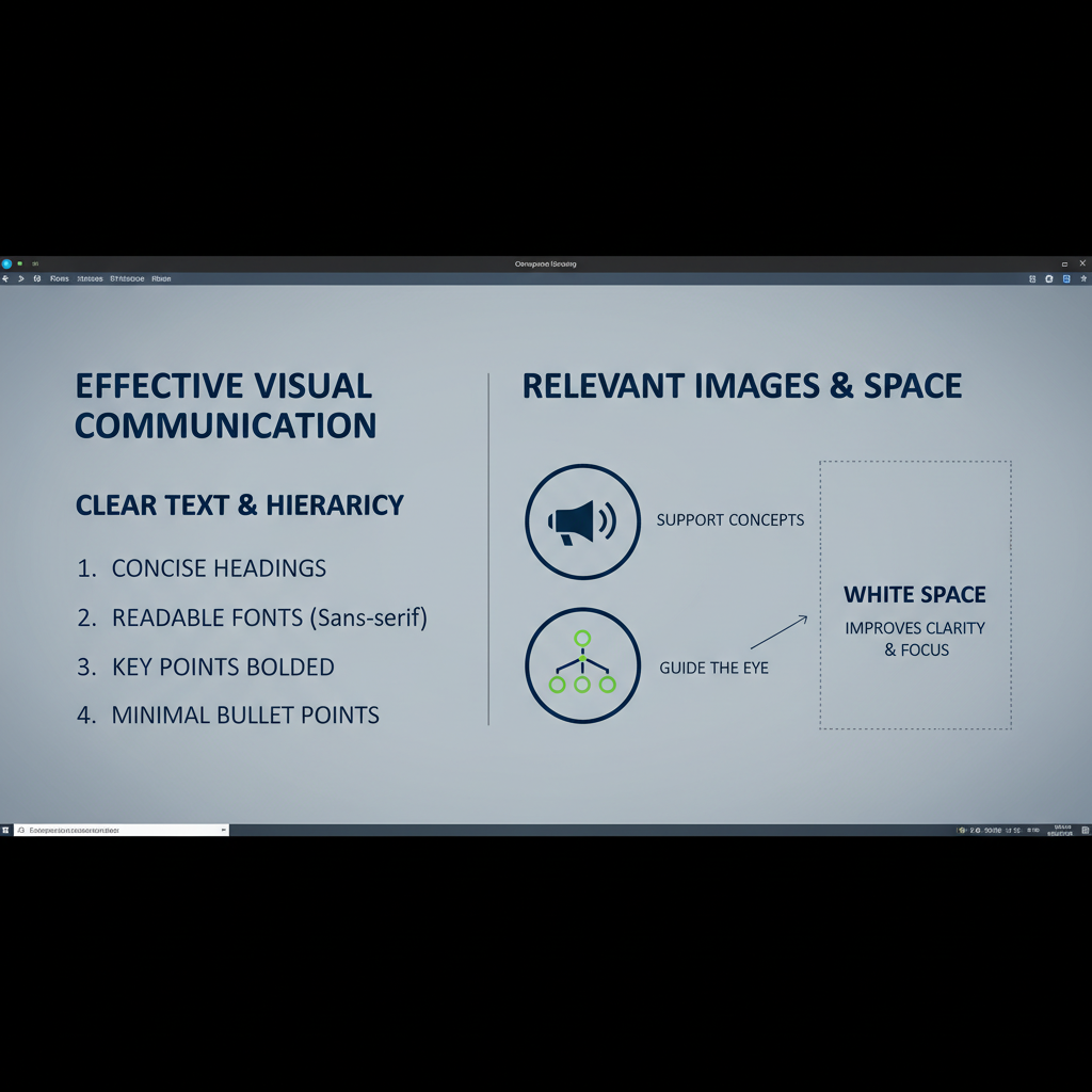 ⚠️ This picture may have spelling mistakes. Trust the words in the lesson.
a. Colors: Choose Wisely, Not Wildly
- Limit Your Palette: Stick to 2-3 main colors that complement each other. Too many colors can make your slides look like a rainbow explosion, which is distracting and unprofessional. Think of a well-dressed person – they usually have a few coordinated colors, not every color of the spectrum.
- Contrast is Key: Make sure your text color stands out clearly against your background color. Light text on a dark background (or vice-versa) is easy to read. Yellow text on a white background? Invisible! It's like trying to see a polar bear in a snowstorm.
- Consistency: Use the same color scheme throughout your entire presentation. This creates a professional and cohesive look.
b. Fonts: Readability First!
- Choose Readable Fonts: Stick to clear, easy-to-read fonts like Arial, Calibri, or Helvetica. Avoid overly decorative or cursive fonts that are hard to decipher, especially from a distance. Imagine trying to read a blurry sign from across the street – frustrating!
- Limit Font Variety: Use no more than two different fonts in your presentation – one for headings and one for body text. More than that creates a messy, disjointed look.
- Appropriate Size: Ensure your font is large enough to be read by everyone in the room, even those in the back row. A good rule of thumb is at least 24pt for body text and larger for headings.
c. Images and Graphics: A Picture is Worth a Thousand Words
- Relevant and High Quality: Use images, charts, and graphs that directly support your point and are clear, not pixelated or blurry. A blurry image is like trying to explain something with a mumbled sentence – it doesn't help!
- Don't Overdo It: While visuals are great, don't fill every inch of your slide with pictures. Give your images and text some "white space" (empty areas) to breathe. A cluttered slide is like a room packed with too much furniture – it feels overwhelming.
- Avoid Clip Art: Many old-fashioned clip art images can make your presentation look dated and unprofessional. Opt for modern, relevant photographs or illustrations.
3. Structure and Flow: Telling a Coherent Story
Every good story has a beginning, a middle, and an end. Your presentation should too! A logical structure helps your audience follow your ideas and prevents them from getting lost.
- Introduction: Start by clearly stating what your presentation is about and what your audience will learn. This sets expectations, like giving someone a map before they start a journey.
- Body: This is where you present your main points, one by one. Organize them logically. Maybe chronologically (first, then second, then third), by cause and effect, or by comparing and contrasting. Each main point should have its own set of slides.
- Conclusion: Summarize your main points and offer a memorable closing statement or call to action. What do you want your audience to remember or do after your presentation? This is your final chance to leave a lasting impression, like the grand finale of a fireworks show.
- Consistent Layout: Use a consistent slide layout (e.g., title at the top, main points as bullet points below) throughout your presentation. This makes it easier for your audience to anticipate where information will appear.
4. Audience Awareness: Know Who You're Talking To
Before you even start designing, ask yourself: Who is my audience? Are they your classmates, your teachers, or perhaps people who know nothing about your topic? Adjusting your language, level of detail, and examples to suit your audience is crucial.
- If you're explaining something to a group of experts, you can use more technical terms. If you're explaining it to beginners, you'll need to simplify and use more analogies. It's like trying to explain a complex video game to someone who's never played before versus someone who's a seasoned gamer – you'd use very different approaches!
- Consider their interests: What might they find most interesting or relevant about your topic? Tailor your content to capture their attention.
5. The Power of "Less is More" (White Space)
Sometimes, the most effective design leaves plenty of empty space. This is called "white space" (even if it's not actually white!). It gives your content room to breathe and helps your audience focus on what's important. Imagine walking into a spacious art gallery where each painting has plenty of wall space around it, allowing you to appreciate it fully. Now imagine the same paintings crammed onto a tiny wall. Which experience is better?
- Don't fill every corner of your slide with text or images.
- Allow margins around your content.
- This makes your slides look clean, professional, and easy on the eyes.
Conclusion: Be a Presentation Pro!
Effective presentation design isn't just about making things look pretty; it's about making your message clear, memorable, and impactful. By focusing on clarity, thoughtful visuals, logical structure, understanding your audience, and embracing simplicity, you can transform your presentations from confusing jumbles into powerful communication tools. Remember, your goal is to help your audience understand and engage with your ideas, not to overwhelm them. Practice these foundational principles, and you'll be well on your way to becoming a presentation pro!
Keep learning, free
Create a free Syllabax account to unlock practice questions and games for this topic.
Visual Learning Enhanced! 🚀
To help you master this topic, we use Advanced Syllabax AI to generate detailed diagrams and visual models.
Note on Visuals: The AI sometimes makes spelling errors in image labels. Please refer to the lesson text for the correct terminology.